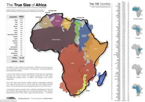
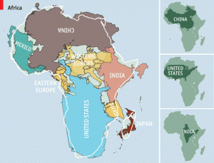
Africa is bigger than China, India, the contiguous U.S. and most of Europe—combined!
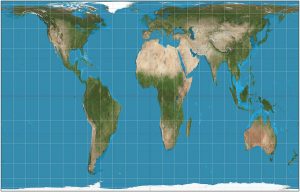
On a typical world map, Canada is a vast nation. Home to six time zones, its endless plains spread from ocean to ocean, dominating great swathes of the northern half of the globe. But, in reality, three Canadas would comfortably fit inside Africa.
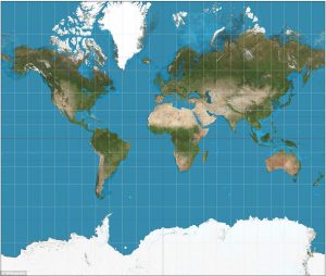
Look at the usual flat map of the world and it appears that Greenland is nearly as big as Africa. But it’s not even close. Africa is 14 times larger. Flat maps significantly distort the sizes of countries and continents, the result of converting a spherical surface to a handy rectangle. The area of landmasses becomes increasingly exaggerated toward the poles.
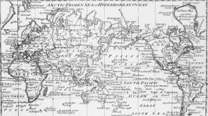
The 1569, Mercator created a projection which was made for navigating the seas — drawing the meridians and parallels as straight lines that cross at right angles helped sailors to navigate some of the their first treacherous voyages around the world. Mercator initially made globes. Later transferring his map from a three-dimensional curved surface to a flat sheet of paper was problematic. Taking the equator as the logical map center left big, confusing gaps near the poles.
Mercator’s solution was to stretch out the northern and southern extremities of the globe to fill those gaps, producing an elegant and usable map. While a revolutionary tool for captains and explorers, the projection distorts the relative size of the continents, to the advantage of the West. The repercussions of this are still being felt today.
But the Mercator still dominates and the digital revolution has further strengthened its position. Today the Mercator projection is used as a template at Google Maps, OpenStreetMap and Bing. From guiding 16th century explorers on the high seas to helping people find Pokemons on their smartphones, Mercator’s work continues to influence how people see the world centuries after his death.
One of the dangers of the Mercator map is that it can make enlarged countries seem unnaturally powerful and intimidating. Sadly, there is no such thing as a perfect map. Because the earth is a sphere — more of a potato-shape, in fact — it is impossible to map it on a flat surface without errors in proportion, explains Kraak. Also the Peters projection has its flaws. In order to show the actual size of land masses, their shapes are distorted.
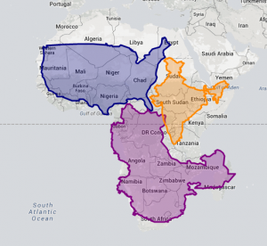
As a result, we tend to underestimate the size of countries close to the equator, and substantially overestimate the size of countries closer to the poles. On our actual planet, Africa is bigger than China, India, the contiguous U.S. and most of Europe—combined!
Scientific American just published a correctly proportioned image to show how Africa swallows up these nations, with Japan thrown in. It also turns out that Saudi Arabia has more area than France, Spain, Germany, Poland and Italy together.
Indeed, Africa is a continent, not a country, but I think you’ll be impressed at how much larger it is than you probably thought. Realizing the true size of Africa also helps us appreciate how daunting it may be to solve Africa’s poverty and food challenges.
